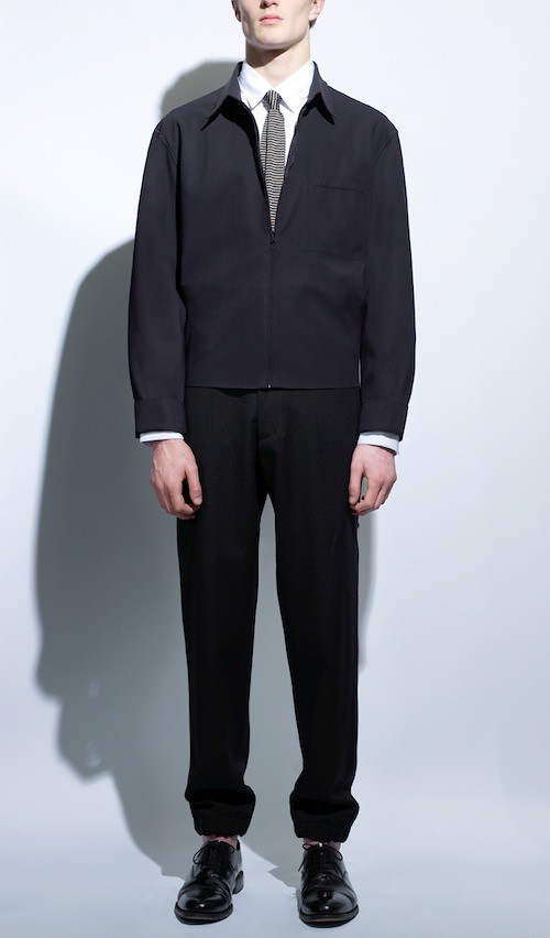
Showing posts with label Tailoring. Show all posts

Saturday, April 30, 2011

Leitmotiv AW11: Light Motiv

Over the last twelve months or so, I have gradually found myself drawn to the previously unsettling world of prints. The mere thought of paisley, camouflage, gingham, polka dot, leopard print or digital creation used to cause sweaty palms. Something changed. One of the factors in my new found confidence was the discovery of Italian label Leitmotiv during the SS11 season of Pitti Uomo. The one thousand, four hundred and seven exhibitors who decided to preview their new collections and projects at this Disneyland of menswear tradeshows caused great excitement during my first visit but it was Leitmotiv who really left the greatest impression. I was slapped silly by the hands of the design duo behind the label and their penchant for clashing and layering of the whimsical. I've kept an excited eye on the pair ever since. 

I'm pleased to declare that Leitmotiv's AW11 collection is as playful as ever. Once more, the talented design duo, Sasso and Carro, have created a dazzling print rich collection that manages to be both familiar and new. Entitled Light Motiv, the collection is a video game that captivates our attention and shifts before our very eyes. For the new season, landmarks, characters and animals merge, mingle and dance around one another in an ever changing configuration of print possibilities. Digital camouflage pixelate and transforms in to urban compositions. The familiar animals emerge from clouds, ornamental mazes or gallop out of nowhere. The more you look, the more you see.

Leitmotive_AW11_2
Leitmotive_AW11_1
Leitmotive_AW11_4
Leitmotive_AW11_6
Leitmotive_AW11_7
Leitmotive_AW11_5

With each passing season, the design duo behind Leitmotiv narrate stories that fascinated us all throughout childhood. Today we relive them through their dazzling prints. The seemingly simple canvas of menswear becomes the canvas that unfolds a tale of dreams and the poetic whims of the pair.

Monday, April 25, 2011

Christophe Lemaire AW11

ChristopheLemaire_Aw11

The name Christophe Lemaire has been bouncing around my head causing excitement with every ricochet for some time now. With each passing season, the seasoned design talent honours a subtle and quiet elegance by creating a seemingly timeless collection of luxuriously simple basics. Heavy figures, with supple and full outlines, are worked in fluid fabrics that fall in an effortless manner and wrap the body without ever concealing it. Lemaire creates an essential wardrobe by putting together the clean and calm lines of western wardrobe with the sophisticated ease and generosity of volumes of traditional eastern garments. It is this very wardrobe that I long to have.

After honing his skills with Yves Saint Laurent and Thierry Mugler, as well as Christian Lacroix and Jean Patou, Lemaire launched his own label in 1991. He has since restored Lacoste's iconic image whilst being its artistic director from 2000 to 2010. Twenty years since starting his own label and the designer has remained relatively unknown. One gets the feeling that this is just how he prefers it. Lemaire is a designer far more interested in style than fashion, the trends and fanfare of fashion are far less important to him than the simple quality of his creations. However, AW11 is a significant season for the design talent. Last month saw the unveiling of his highly anticipated Hermes debut. Whilst filling the rather large shoes of Jean Paul Gaultier with widespread acclaim, Lemaire continued the quiet evolution of his own label.

The AW11 collection takes its inspiration from Serguei Parajanvov, Georgian film director and visual artist known for living elsewhere, in dreams made of myths and icons including David Byrne, Nicolas de Staël and John Luly where a love for beauty and for light in its uncertainty of location and time blend with the rich colours of his images. To mark this significant season, we were fortunate enough to ask the designer about the maturity of his label and his hopes for the future whilst taking a closer look at his latest creations...

ChristopheLemaire_AW11_1

SS:What were your inspirations, your dreams and the driving catalyst behind launching your own label? Both in 1991 and then your return to it in 2007.
Christophe Lemaire: From the very beginning to this point, I have always been driven by the same idea: trying to create in my clothes the perfect synthesis between simplicity and quality. This idea has just grown up with maturity.

SS: How has the label and your approach to it evolved over the years?
Christophe Lemaire: I strive to improve the same pieces season after season. We really push the idea that once you like a garment you want to wear it all the time . We give that possibility by offering a perfect basic in a wide range of fabrics.

SS: What were the first and last item you remember designing?
Christophe Lemaire: Uniforms!

SS:Your collections are always a wonderful blend of references. What was your initial starting point for AW11?
Christophe Lemaire: I like the idea of synthesis as well as blurring the frontiers between genres. I don’t want the references to be too obvious.

ChristopheLemaire_AW11_2

SS:How did the varied figures of Sergui Parajanov, Nicolas de Stael, John Lury and David Byrne influence your designs?
Christophe Lemaire: Serguei Parajanvov’s movies for textures and colors that mix with a very poetic and refined sensitivity. David Byrne for the effortless sharp sense of style. Nicolas de Staël for the beautiful obviousness of a black shirt and a black pleated pants. John Lury for the sophisticated ease.

SS: As a designer, would you agree that you are more interested in style than fashion. How would you describe your approach to design?
Christophe Lemaire: Observing our everyday gestures, environment, and responding to it.

SS: Your designs continually evolve to push a form of luxury fashion to new limits. Proportion, silhouette, cut, fabric and method are all central components. What is luxury to you?
Christophe Lemaire: Time.

SS: There is a definite sense of timesless-ness to your designs. Withe each collection you create an era defying wardrobe consisting of exacting basic pieces whilst experimenting with shape, cut and form. If you could go back in time and experience one moment or era of fashion, what would it be?
Christophe Lemaire: The 20’s were a fantastic innovative era, liberating the body and mind, and radically switching from the western tradition of corset to the Asian tradition of tunic and kimono, or the ancient Greece art of draping: all about shoulder and hips.


ChristopheLemaire_AW11_3

SS: The idea of a personal uniform is something that we've been mulling over since before we even started the blog. The concept of uniform is certainly an important facet of your work - do you have a personal uniform?
Christophe Lemaire: Three-pleated pants, an officer collar shirt and a double-breasted jacket as easy to wear as a waistcoat, all in the same fabric. Wool flannel for winter, linen and cotton for summer.

SS: How has the oft cited Walter Albini phrase, 'Sometimes to dress is to leave a little', influenced you as a designer?
Christophe Lemaire: To dress is to say what you would like to be, how you see yourself. There is something very playful about it, you need to dream. It is actually something quite deep.

SS: Finally, how do you see Christopher Lemaire, the brand, developing over the next few seasons, as you simultaneously take on the creative director role for Hermes?
Christophe Lemaire: We want to develop Christophe Lemaire as a lifestyle brand and edit complementary objects to the collection. Also, the Paris shop should be a unique place where people can come for advise and find a piece that will respect their individuality. Of course, collections should always improve.

Christophe Lemaire Homme
All images courtesy of Christophe Lemaire and taken by Axel Jansen

Friday, April 15, 2011

1205 AW11

Feature Button - 1205 AW11

We have long been interested in the interplay between the social constructs of masculinity with style and menswear. On a number of occassions we have attempted to explore the myriad of influences on how men dress but tend to struggle. Thankfully a number of designers are posing and examining the questions for us and the resulting collections are full of variety and interest. Paul Garbase eloquently explores the tension between masculinity and femininity in everything she designs. She manages to capture both the femininity inside very masculine garments and the masculinity inside more feminine pieces. Now, we first introduced her label 1205 back in April last year and have kept an interested eye on the designer ever since. Fresh after the widely acclaimed debut unveiling of her designs for Woolrich Black Label during New York Fashion Week, the designer has returned to London to reveal 1205's AW11 collection. 

Once again, regardless of gender, this 1205 collection showcases Gerbase’s trademark sensitive use of luxury fabrics and erudite pattern construction for a modern, contemporary muse. When I spoke to the design talent about the evolution of the label last year, she professed that it was a natural progression from what she had learned in pure tailoring and signaled a return to her original design passion. Having learned the strict rules of tailoring at Hardy Amies and Kilgour alike, Gerbase is now in the knowledgeable position to ignore a few of them along the way. Her mantra of "I think if something is well made and the fabric is great then it should not matter whose wearing it" still echoes in my ears as I admire the latest collection...

1205_AW11Lookbook_1
1205_AW11Lookbook_2
1205_AW11Lookbook_5
1205_AW11Lookbook_8
1205_AW11Lookbook_10
1205_AW11Lookbook_12
Look book images supplied by 1205
Photography: Ben Dunbar-Brunton. Art Direction: Paula Gerbase. Styling: Jakob Brondum

The balance between menswear and womenswear or masculine and feminine has been an intriguing and thought provoking facet of each of her collections. Here, Gerbase plays with fabric in a menswear way for women and experiments in a womenswear way with cutting.  As a consequence of her menswear and couture training, quality of cut and fabric are paramount in Gerbase’s designs. The design process begins with fabric, looking at everything in a microscopic way, resulting in a unique, modern, almost clinical point of view.

For AW11, the designer has looked towards creating texture and pairing more functional fabrics with traditional fabrics. A combination of the finest English, Swiss and Italian fabrics. Earlier this week I was invited to see the latest collection of menswear, womenswear and unisex pieces at her studio space in Bloomsbury and could not resist taking a few detail shots. We have long declared that the real beauty of menswear is in the details and will never tire of taking the time to celebrate the finer details of men's style. Here, Gerbase experiments with fabric combinations and cut to create timeless and utilitarian clothing which is detail rich for both sexes.

IMG_0691
IMG_0709
IMG_0679
IMG_0672
IMG_0669
IMG_0655
IMG_0681
IMG_0666
IMG_0645
IMG_0677
IMG_0637
IMG_0712
Deatil shots of a number of items that caught my eye.

With each season you only ever really encounter a handful of collections which leave you truly excited, inspired and questioning your own current wardrobe. The return of Paula Gerbase's 1205 is certainly one for AW11. Building on the success of her first two collections and her work with Woolrich Black Label, I'm sure 2011 is going to be an even bigger year for this design talent.

Friday, March 18, 2011

A. Sauvage's Black Volta

Cast your minds back to the busy month of May last year, where I zigzagged my way across the capital for various press days and viewings to help see what AW10 would bring, one of the real highlights and favourites was A. Sauvage. I've kept a close eye on the development of the brand ever since. For those of you with short memories, the label is the brainchild of Adrien Victor Sauvage who whilst working as a creative realised that the stylish demands of his clients were not being met so set about meeting them with his own designs. Simply put, the label works on the deceptively simple principle of perfecting cut and concentrating on fit.

As his SS11 collection begins to land in Harrods and Matches, I'm pleased to share the look book shots for Black Volta. Once more, to make matters even easier for the every man he has practically created an fool proof guide of creating ensembles within his look book. Of course there are a myriad of ways each piece can be worn but for those less confident, he has created a look book of colour co-ordinated assembly line-esque, everyday dressing...

1
6
7
10

Now, one of the methods Sauvage has used to tell the creative narrative of the label has been through his intimate portrait photography. His exploration in the field of portraiture began with the Captain and Native series which really captured the imagination of the blogosphere. I personally loved the questions that the photographic project asked about sartorial individualism. What does a suit mean to you? How do you wear a suit? It managed to document the intriguing relationship between A. Sauvage's tailoring and interesting names from the art, literary and film worlds. To celebrate the launch of his SS11 collection, Black Volta, Sauvage presents a new series which will soon be available to view on his journal. To whet your appetite I can offer the following image of Anthony Bonsu.

ANTHONY <span class=
Black and white photograph by Adrien Sauvage.
Anthony Bonsu wears 000-9 from 000-1- 000-11 Kente D.B Tuxedo Jacket and white tuxedo shirt
All images courtesy of A. Sauvage.

After an eleven year absence Sauvage revisits Ghana, capturing the inspiration for Black Volta in the process. Here his portrait photography of family, friends and the surrounding neighbourhood, sees natives dressed in the collection. As in previous series, the designer and photographer invites subjects to wear garments from his collection and encourages them to express who they are whilst wearing a suit with no directorial interference. Having established the loose parameters of the experience it is left up to each subject to decide what to wear, diverse as they are, from the collection. By revisiting his heritage a new story begins yet the collection builds on the same principle of perfecting cut, concentrating on fit and adding pieces to the range as season and need demands. Look out for more from the series over on his absorbing journal.

Monday, March 14, 2011

Braille Studio Visit

Braille_FeatureButton

In just over twelve months Braille have carved a covetable reputation for creating reimagined wardrobe staples. In all three of their collections to date the design duo have showcased a wonderful sense of texture, as pieces revealed a heady mix of luxurious fabrics. The fabric combinations in the pairs outerwear are always of particular note. Textural highlights in their recent AW11 collection, Our Damn Hands, include a waxed belted silk poncho, a textured wool pocket overcoat and a suede reversible corded bomber to name but a few.

Having spoken to the pair two weeks ago in a post that unveiled their look book, I could not resist an invitation to take a closer look at the designs. Here we explore their East London based studio and cop a feel of a few SS11 and AW11 season highlights...

IMG_7666
The title, Our Damn Hands is a direct reference to the fact that this collection was completed up to the sampling stage with minimal assistance from interns or pattern cutters, right here in the studio.

IMG_7668
A few of the patterns

IMG_7659
The remains of the AW11 mood board, soon to be replaced with the inspirations of SS11

IMG_7586
One of the most memorable piece from SS11, there is just so much texture in this zipped top.

IMG_7625
Waxed cotton and wool.

IMG_7634
Luminescent tweeds gave visibility to the night explorer for SS11

IMG_7647
Fabric cut offs transformed.

IMG_7623

The contrast blazer updated for AW11.

IMG_7595
The fastenings are a particular highlight of AW11.

IMG_7607
A simple blazer is transformed with the use of these clips.

IMG_7619
The Duffle Coat has received a great deal of press and buyer attention. When you pick it up you can sense from its weight that it is going to keep you nice and warm, the pair used leather binding as a bridge between the softness of the wool and the hardness of the fireman's clips.

In all of Braille's garments there is always an intriguing balance between the strong and the delicate, something inherently 'masculine' yet genteel at the same. Having forged such a strong design signature in three short seasons, something tells me that 2011 is going to be a big year for the pair. Come SS12 the label will be in a good position to begin selling to the international boutiques that they've had their eyes on since the beginning.

Sunday, March 13, 2011

Details: Contrast Blazer

IMG_7661
One half of design duo Braille, Benjamin Vorono, wearing the label's much coveted contrast blazer.

Saturday, February 26, 2011

Tim Soar AW11 Him/She


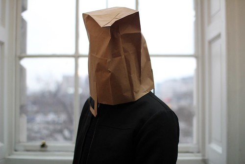
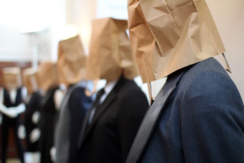
During a day that saw me ricochet from Somerset House to the Royal Opera House and back again multiple times, the opportunity to stand still and admire was greatly appreciated. One such opportunity was afforded by Tim Soar's presentation in the Navy Board Rooms. Here, weary menswear folk gathered with a glass of champagne to gleefully toast the continued rise of the designer whilst admiring his collection of androgyny grounded in menswear.

For the last few seasons Soar has busied himself with examining and reinterpreting the true classics of menswear. Appropriating hits and remixing them to his own tune to much acclaim. He has ultimately produced collections which feel warm and familiar, those which have many overlapping memories and echoes from the past yet, at the same time still feel modern. Thankfully, this is a process that he continues for AW11. However, this time, he offers a carefully crafted concept of a functional wardrobe where many of the styles are available for women. Despite being grounded in menswear, the collection is as much for women as it is for men. Soar has managed to strike a perfect balance between menswear and womenswear or masculine and feminine. Both sexes are happy and well dressed as they nod along to Soar's tune. The focus is on making each piece desirable in its own right, regardless of gender. It was a pleasure to examine them up close as I walked around the presentation of faceless mannequins clad in the designer's signature mix of tailoring and sportswear...


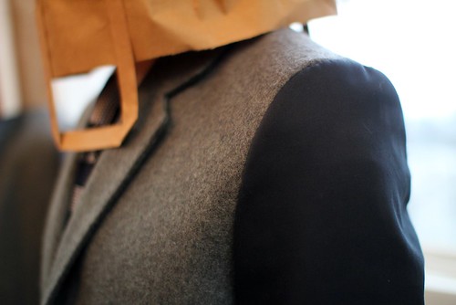
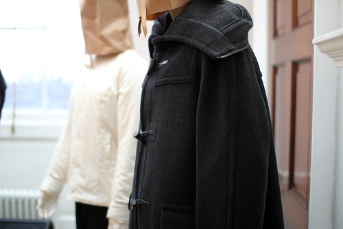
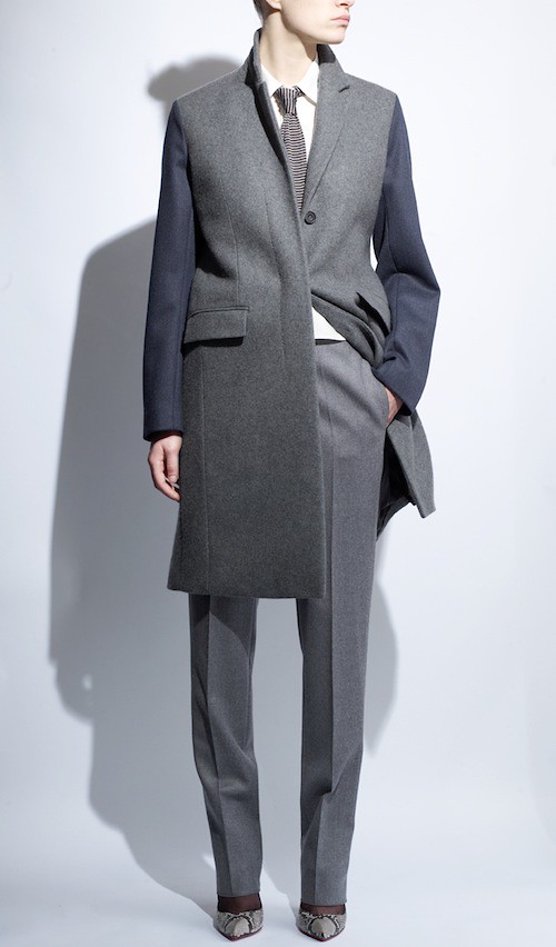
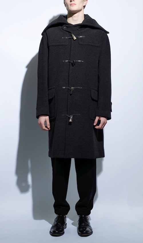
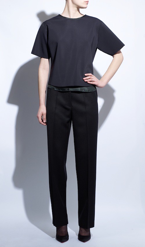
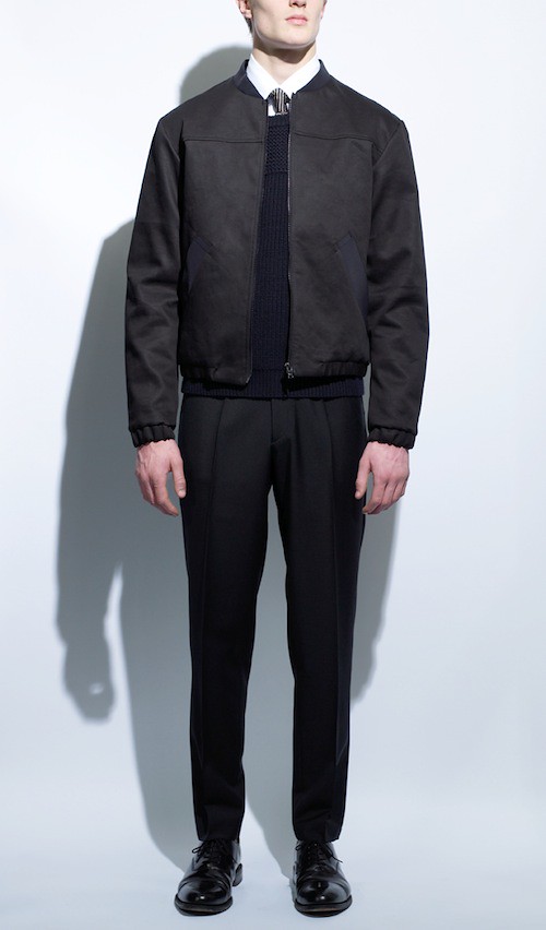
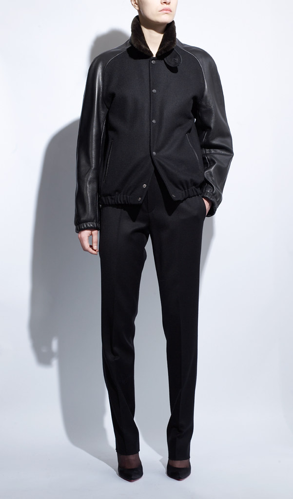
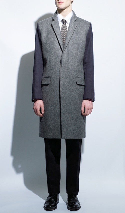
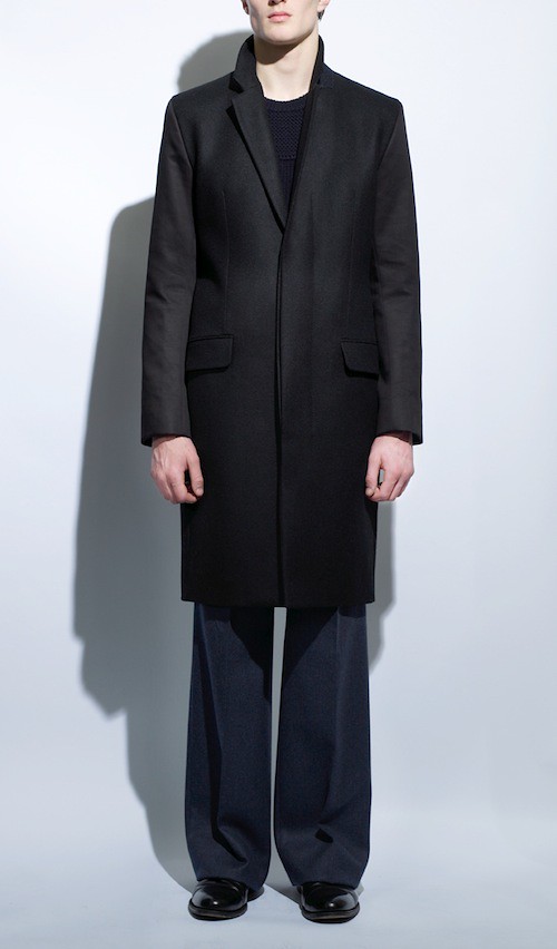
For Him, Soar is interested in the point where tailoring and sportswear meet. The apex of good menswear. Here, he reveals Velcro waistband tuxedo pants, the zip hood duffle coat (a collaboration with noted London tailor, Joe Allen), the neoprene Harrington jacket and the striped, coated cotton dress shirts. Knitwear is either heavy with zips or latex coated. There are tailored ski panes and lacquered wools. However,the real highlight is the topcoat and its mix of heavy melton with bonded cotton sleeves. For She, Soar has kept the masculine mood of the collection. Each piece has started in menswear and delicately evolved. In fact, as I walked through the presentation, many of the style looked almost identical to the equivalent men's garments; the topcoats, jackets, trousers and knits. However, great care has been taken to ensure a fit that is flattering, chic, feminine.

The most obvious thread that tightly bonds this collection is the use of the classic fabrics of menswear which are used throughout. Soar is a long time collector of vintage military and has always loved the density, texture and strength of the wools used in British Army Dress uniforms. When he found out that Hainsworth was the company that produces many of these wold, he just had to work with them. In fact, Hainsworth is a specialist textile company that has been an unrivaled market leader for over two hundred and twenty five years, kitting out the Royal Guards uniform to the plush interiors at Windsor Castle. In choosing a palette of RAF blue-grey, Rifle Green and Khaki, Soar managed to paint a collection that felt simultaneously modern and classic. While, bonded and coated cottons, neoprenes, spun Fuji silk, double crepes and Japanese Plange leather carry on Soar's design signature mix of minimalism, sportswear, tailoring and unusual fabrications.

In light of the packed presentation space I was only able to shoot a few close ups but thankfully, Soar sent through his recently shot look book which I'm pleased to share with you...


Lookbook images supplied by Tim Soar. Styling by Jodie Barnes.

Over the last few seasons, we have come to Tim Soar's collections as offering his take on the greatest hits of menswear. It is not about the exploration of a unique silhouette for the season and then moving on but rather, it concentrates on taking different elements and putting them together in a way that is a coherent whole while exploring a number of different references. In an interview with us last season, he declared that "you don't have to reinvent the wheel, especially not with menswear. The wheel exists, we just have to polish the spokes." Now, women can finally ride Tim Soar's well polished bicycle of menswear.