Showing posts with label Colour. Show all posts

Saturday, April 30, 2011

Leitmotiv AW11: Light Motiv

Over the last twelve months or so, I have gradually found myself drawn to the previously unsettling world of prints. The mere thought of paisley, camouflage, gingham, polka dot, leopard print or digital creation used to cause sweaty palms. Something changed. One of the factors in my new found confidence was the discovery of Italian label Leitmotiv during the SS11 season of Pitti Uomo. The one thousand, four hundred and seven exhibitors who decided to preview their new collections and projects at this Disneyland of menswear tradeshows caused great excitement during my first visit but it was Leitmotiv who really left the greatest impression. I was slapped silly by the hands of the design duo behind the label and their penchant for clashing and layering of the whimsical. I've kept an excited eye on the pair ever since. 

I'm pleased to declare that Leitmotiv's AW11 collection is as playful as ever. Once more, the talented design duo, Sasso and Carro, have created a dazzling print rich collection that manages to be both familiar and new. Entitled Light Motiv, the collection is a video game that captivates our attention and shifts before our very eyes. For the new season, landmarks, characters and animals merge, mingle and dance around one another in an ever changing configuration of print possibilities. Digital camouflage pixelate and transforms in to urban compositions. The familiar animals emerge from clouds, ornamental mazes or gallop out of nowhere. The more you look, the more you see.

Leitmotive_AW11_2
Leitmotive_AW11_1
Leitmotive_AW11_4
Leitmotive_AW11_6
Leitmotive_AW11_7
Leitmotive_AW11_5

With each passing season, the design duo behind Leitmotiv narrate stories that fascinated us all throughout childhood. Today we relive them through their dazzling prints. The seemingly simple canvas of menswear becomes the canvas that unfolds a tale of dreams and the poetic whims of the pair.

Saturday, April 16, 2011

Time to Slack

IMG_6592
T&F Slack's five eyelet Derby used by Matthew Miller during Menswear Day.

Over the course of the last few months I have found myself admiring a kaleidoscope of brogues and derby shoes but have failed to note down the name of their maker. Blog readers, I have failed you but I will now make amends. The first time I came across the brand, T&F Slack Shoemakers was during the most recent, hectic Menswear Day as Matthew Miller collaborated with the Notting Hill based shoemaker to stunning effect. Now, I really should have followed up with the brand the moment my heart returned to its natural beat after the strain of fashion month but the name was lost somewhere in the deepest, darkest corner of my blogging mind. More recently I have seen the designs on the shop floor at both Selfridges and Liberty's and the final nudge to feature the SS11 collection came from Kuni Awai, who is undertaking an ongoing collaboration with the label. No more slacking on this brand.

Now, to the best of my knowledge, T&F Slack Shoemakers is the only shoe brand able to offer classic English styles made in the heart of Notting Hill. In a bit to revive shoe manufacturing in London, the brand began crafting shoes in their own five hundred square foot factory in  March 2008. Today, they make about one hundred and fifty pairs per month.  For SS11, the collection consists of an impressive array of vibrant Derby with two sole options, either colourful lightweight micro soles or stitched leather soles, Oxford Brogues fit for any playful Sunday Best outfit, loafers and even a punch Derby for an extra statement of lively intent. All are perfect to add a splash of vibrant colour to an outfit. I am reminded of a famous Matisse quote, "With colour one obtains an energy that seems to stem from witchcraft."  There is certainly some truth in this observation from the great master. Even if the weather is dark and gloomy, wearing colour rather than blending in with the clouds is much better. Escapism even. A splash of colour can really help lift your mood so why not start with your feet?

IMG_1506
Oxford Brogue

IMG_1535
 Derby Five

IMG_1570
 Punch Derby

IMG_1809
Derby Two.

Over the course of the coming weeks I will certainly pay a visit to T and F Slack's Notting Hill shop where in addition to showcasing their fine collection of men and women's crafted English styles, they offer a unique made to order offering. The service takes up to three weeks and designs are available in a wide range of colours and materials. Their highly skilled craftspeople, both within their Notting Hill factory and East London workshop keep the art of British shoemaking alive and well in London and I cannot wait to pay them a visit.

Wednesday, April 13, 2011

Details: Fruit bowl palette

IMG_9049
Kronkron's very own Magni Thorsteinsson taking colour inspiration from the fruit bowl. Love the combination of orange and tangerine.

Sunday, April 10, 2011

Anglo Sky

IMG_0199
Cobalt blue braided leather belt by Anglo in front of a blue sky.

Have you noticed how the mood lifts the moment that blanket of winter grey doom and gloom lifts and is replaced by a surrounding of blue? The last few days have seen nothing but hazy sunshine and near cloudless skies and everyone seems happier for it. I'm certianly in the mood to celebrate the arrival of warmer days. Yesterday, this cheer took me for a stroll down one of my favourite London streets, Lamb's Conduit Street in Bloomsbury, where I could not resist the retail allure of Darkroom. Since opening its doors in late 2009, I've popped in at every opportunity and often walked away with a little something. This concept store comprises of a curated mix of interior and fashion accessories alongside regular art and sculpture exhibitions which combine to continually pique interest. My latest visit was timely as they had just taken receipt of a delivery of colourful braided belts from Anglo.

Now, Anglo Leathercraft's belts and bags are all made in England using the finest and most intricate leather working techniques. The British brand has amassed quite a following in Japan, yet are little known in the UK. Darkroom is helping to change that though and the latest collection of brightly coloured braided leather accessories are perfect for the warmer months. So perfect in fact that I could not resist the cobalt blue option.

"Blue days all of them gone, nothing but blue skies from now on."

Tuesday, March 15, 2011

Agi & Sam AW11

Agi&SamFeatureButton

Now this is the story all about how
My life got flipped, turned upside down
And I'd like to take a minute just sit right there
I'll tell you how I came to love prints right out of nowhere...

Now, my caution towards prints in all of their myriad of forms is well documented on the blog, as is my desire to turn this sartorial uneasiness in to a gun ho approach of colours and designs but it has been a slow process. Agi&Sam have taken my nervous hand and duly slapped me silly with it. Thanks to their penchant for clashing and layering print upon print, the design duo opened my eyes to print possibilities during their presentation at Menswear Day.

Aiming to be revolutionary in their approach to print design, Agi&Sam experiment heavily with texture and colour, stretching the boundaries of digital printing with each season. In most pieces, references are torn apart, manipulated and reassembled to create eye-catching, wearable clothes which provoke the odd wry smile or a rendition of a certain well known American sitcom themetune. Following that hectic day and with the prints still fresh in my mind, I scheduled a visit to meet the design duo at their Dalston based studio. Over a cup of tea, the pair talked me through the label and afforded me the opportunity to take a closer look at their designs. What follows, after a quick reminder of their presentation, is my account of an afternoon with Agi&Sam...

IMG_6497
IMG_6488
IMG_6484
IMG_6549
IMG_6493
Menswear Day reminiscing once more. Agi&Sam's cacophony of prints were undoubtedly a highlight.

Agape Mdumulla was born in Tanzania and brought up in North Yorkshire. He studied Fashion Design and went on to present his first collection at London Graduate Fashion Week in July 2008. Following an enthusiastic response Agape went on to show at Iceland Fashion Week in 2009. The other side of the design coin is Sam Cotton who was born in Stratford-upon-Avon and studied Illustration. He has worked as a Fashion Illustrator and Print Designer at Karl Lagerfeld, Alexander McQueen, Armand Basi, Carolyn Massey, Blaak Homme and J.W. Anderson to name but a few. The pair met whilst they were both interning at McQueen, Agi on the design side and Sam on the print team. Shortly after this fruitful internship came to an end, both of them started applying for jobs but really struggled to find anything suitable. They found freelance work here and there but in terms of anything permanent, it was quite a depressing time. After a number of disappointing months, it finally reached a point, just after the Christmas before last, where they decided to take matters in to their own hands and create something together. After a number of brainstorming months with regards to the name of the label,  Agi&Sam was born.

Over the course of the last twelve months, the design dynamic of the pair has been the catalyst that drives the label forward. Two disciplines, print and design striving forward. Sam notes that "the naivety of each others discipline can work as an advantage. A question or an idea could take a piece in a completely different direction." The duo are involved in everything together. It is a lasting collaboration in ever sense. As they design a collection, they both learn off of each other and collectively push each piece as much as they can. This is no more apparent than in their AW11 collection.

The collection evolved from watching late afternoon television is their studio (which also doubles up as Agi's living room. The first ideas were borne out of watching The Fresh Prince Of Bel-Air every day. During this viewing routine, the pair began noticing and admiring what Will was wearing and in particular how he styled them. Sam enthuses "Our mood board for the season is amazing. There is one particular piece which is probably the most noticeable, the iconic thing that he did, which was turning his blazer inside out. We ended up creating a jacket very similar, the facings are set outwards but it still has a lining on the inside. The styling in the show was amazing." However strong the style of Fresh Prince was, the design duo didn't want the collection to be one dimensional so they researched and began to integrate other elements. They looked at Will's movement and gentrification and the effect that the movement from a working class neighbourhood to his luxurious life had on his life and the reversal, the life of Basquiat. The collection soon expanded from here, bringing in Basqiat's art, and all aspects of his life before adding nuances from the 90s London scene. Within this collection the pair explored various print possibilities, from magic eye to Bridget Riley inspired stripes to wonderfully cut 3D tailoring.

IMG_7926
IMG_7939
IMG_7922
IMG_7920
IMG_7959
IMG_7944
IMG_7930
Prints charming in their studio. From Potato Smiles to Basquiat and Bridget Riley, the collection layers them all.

To realise their sketches for the collection, the pair had to digital print on synthetics. The search for a factory in this country who offered this service was a long one but ended with RA Smart. Now, R.A. Smart has over thirty years experience supplying screenprint and digital equipment to the Graphics and Textile Industries but their synthetics division tend only to make flags. Fortunately for Agi&Sam the experienced printing company sponsored their collection and the results are outstanding.

As useful as my in studio detail shots might be in highlighting key prints and the duo's working environment, I just had to include their look book. Now, these images have caused a bit of a stir on the likes of Hypebeast and Highsnobiety and we did chuckle over a few of the comments...OMG this guy needs a swirly, a wedgie, and his lunch money stolen STAT. Dude looks like Wesley Snipes. In essence, the look book helps to help bring the cacophony of prints to life and reminds us that the duo are keen to inject a bit of humour in to their designs whilst the explore the boundaries of the use of print within menswear...

agisam-2011-fallwinter-collection-3
agisam-2011-fallwinter-collection-4
agisam-2011-fallwinter-collection-12
agisam-2011-fallwinter-collection-14
agisam-2011-fallwinter-collection-5

----------

Whilst continuing to experiment with prints in my daily style, I'm really looking to watching this brand develop over the coming seasons and beyond. Alongside the likes of Matthew Miller and William Richard GreenAgi&Sam are pushing for a place in the MAN lineup. These are exciting times for menswear in the capital.

Wednesday, February 16, 2011

Forgotten Future AW11


Back in July last year, I discovered and rediscovered Richard Dawson's label Forgotten Future and have kept a close eye on its development ever since. His third collection, entitled Pony Youth features an eclectic mix of attention grabbing pattern and texture that makes this blogger want to reach out and touch. For AW11, Dawson has once again served up a heady cocktail of vintage detailing and sportswear styling. Here is a quiet preview of the collection before we get swallowed up by LFW and grow too weary of beautiful clothes...

For AW11, Dawson has once again served up a heady cocktail of vintage detailing and sportswear styling. Partly influenced by the work of photographer Perry Ogden, who in the 1990's documented the disappearing youth culture at Dublin's Horse Fairs, this collection pervades the Irish estate youths nonchalance throughout. A generational hand me down aesthetic runs through the collection to inspire a silhouette of over sized proportions. A particular highlight is the Fair Isle patterning that echoes the images captured by Ogden's lens. Here, it has been reinvented in printed, digital form and incorporates motifs and off beat colourways. Other influences continue the post war feelings introduced by the previous season, evolving the make-do-and-mend approach to much cherished and well worn garments. Pocket detailing from an uncovered pair of 1950's American scout trousers affords a casual work wear approach to the collections tailoring. Even more interestingly, darning, a somewhat forgotten homespun craft is reinterpreted as a casual play on embellishment. Worn areas of a favourite blazer are given a new lease of life, challenging the notion of disposable fashion to create a hand crafted feature which underlies Dawson's ever apparent celebration of the worn and loved....


Look book credits. 
Photography by David Poole. Model is Owen Trainor.
----------
Silhouette and proportional play are key to Forgotten Future's aesthetic along with a high degree of workmanship. This collection expresses an everyday sartorial nonchalance that I just love. Once again, Dawson has created a collection of wardrobe staples that transcend trend by originality and individualism.

Monday, January 17, 2011

Baartmans & Siegel's AW11 Deckard


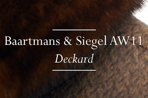
On the bluest of blue Monday's we have a real treat for you. Baartmans and Siegel's AW11 collection, entitled Deckard, should help transform you from a damp Eeyore to a bouncing Tiger in a matter of stylish moments. Since we showcased the degree collections of the Dutch/English design halves that make up Baartmans & Siegel, the label has become one to watch, recognisable by the pairs use of interactive texture and sharp tailoring. For AW11, they have evolved their offering by developing these signatures even further and have introduced new covetable threads such as the interspersion of draped, soft, rounded tailoring amongst the sharp cuts and have experimented with even more tactile fabrications that provoke endless stroking and much luxurious comfort.

This suit is a new technique of printed velvet, a light base grey allows for a murky cloud print which creates texture and shadow. The pair developed this digital print alongside a velvet specialist to create tailoring of a type, this blogger has not seen before. 

Of course,  Deckard takes its inspiration from the 1982 science fiction film Blade Runner. Deckard is the existential detective. The blade runner who tracks down artificial humans in this futuristic noir-scape, ensuring their destruction. However, rather than an obvious homage to the dystopian urban characters and scenes created by Ridley Scott, Baartmans & Siegel looked deeper and picked out key themes to create pieces that are wonderfully subtle yet highly wearable and detail rich. This is performance lux. Functional items that effortlessly combine luxury with a sense of protection throughout.

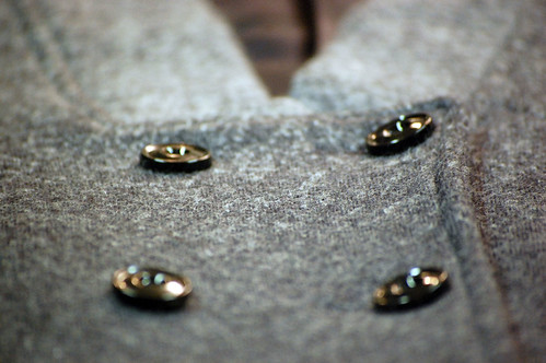
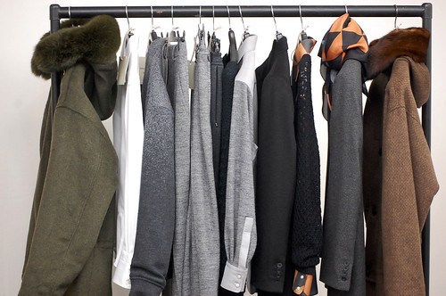
Texture, texture, texture.

Combinations of texture, always tactcile and ever comforting.

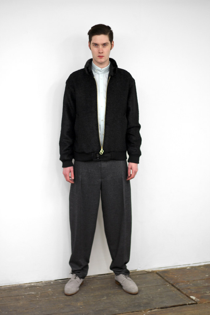
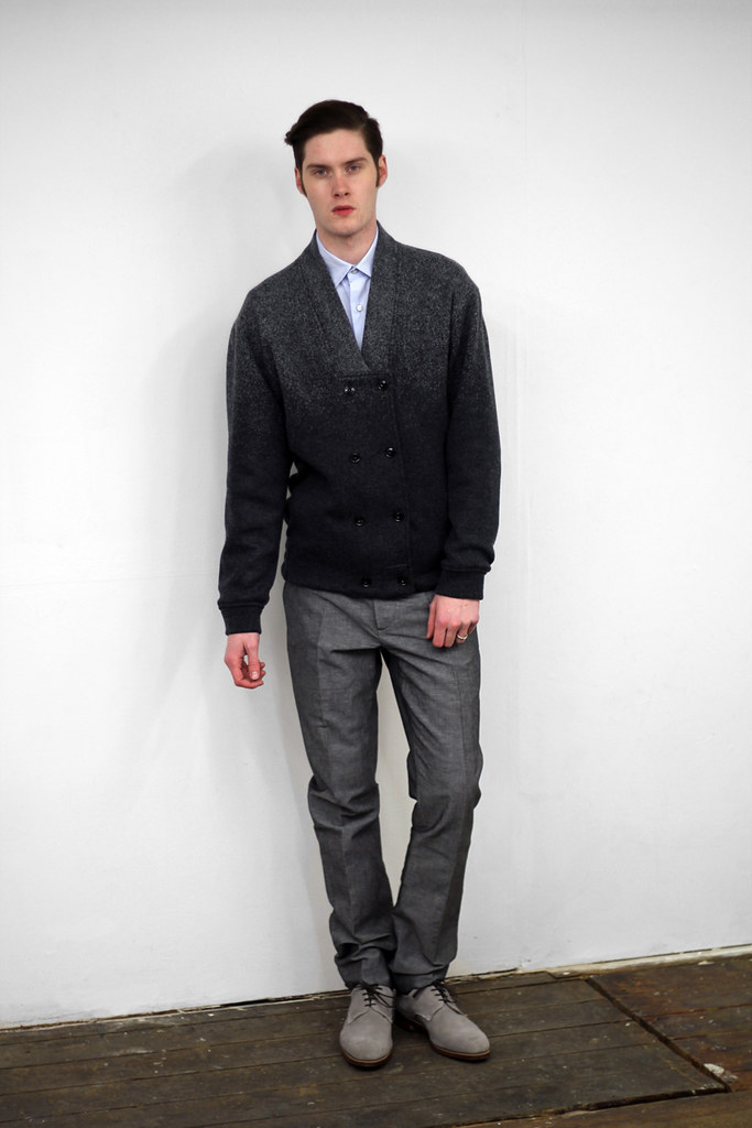
Two pieces which are particularly interesting are constructed by a gradient double knit grey wool which adds a subtle frosting luxe to the casualwear items.

Self described as modern-traditionalists, Wouter Baartmans and Amber Siegel’s work focuses on beautiful fabrics that seduce, and shapes that are accessible yet distinctive. Once again, fabric is key for AW11. Here the collection predominantly uses a variety of silks, wools, linens and mohairs. They have worked with Italian, Japanese and Swiss textile mills to ensure that they have sources the most innovative materials of the highest quality. The collection has been designed so that many of the pieces are interchangeable and to give the wearer more stylistic control. It is important for both Amber and Wouter that each garment is strong individually, while flexible enough to be combined and to interact well with others.

This collection contains many technical fabric elements which relate to their inspiration of futuristic si-fi environments, such as those created int he novel by Phillip. K. Dick- "Do Androids dream of electric sleep? and in Ridley Scott's Blade Runner.

The exciting design duo have always experimented with texture combinations in their collections, at times with spectacular effect, but here the pair have experimented across individual pieces. If the pieces themselves do not demonstrate physical texture, they at the very least demonstrate visual texture. This is a collection that is a celebration of detail and a treat for both the eyes and skin.

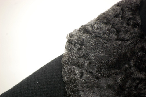
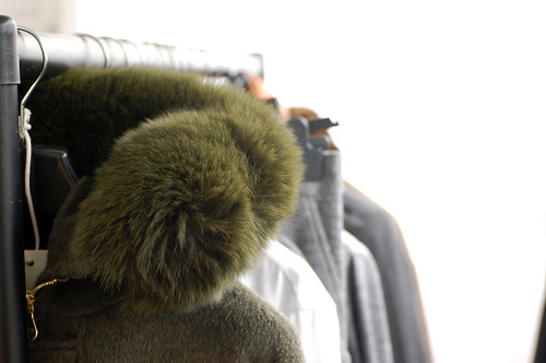
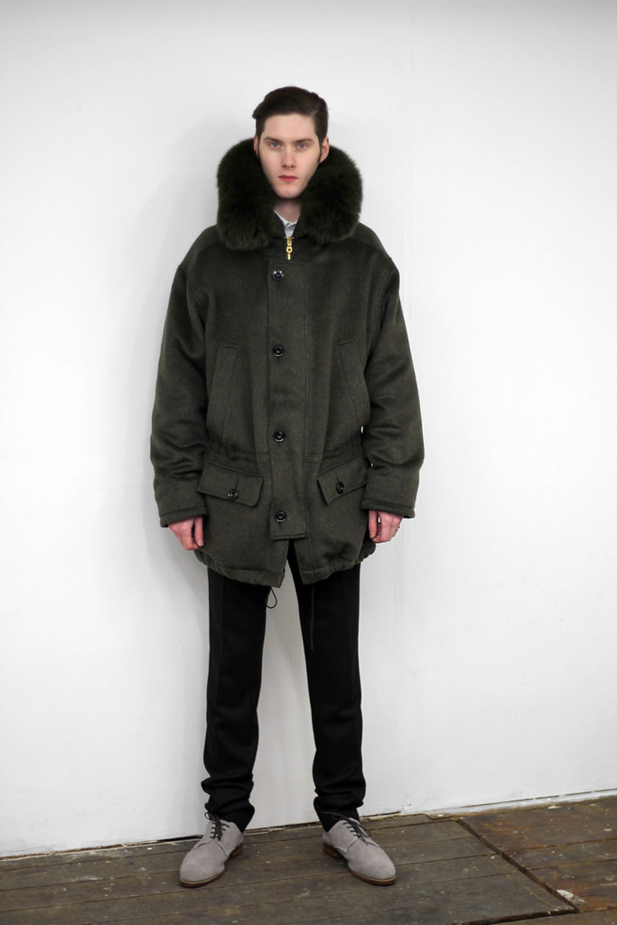
I just love the height of this fur hood. Super luxurious parka.

The electric glow of the collection.

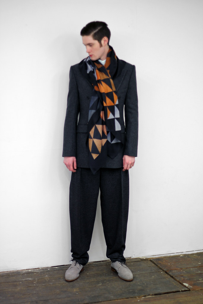
Ridley Scott's masterpiece provided a great deal of inspiration for the colour palette. Colour is used with subtle effect, creams, inky cloud prints, greens, burnt oranges echo the protagonist's attire and the dull electric glow that haunts the futuristic urban landscape. The pair replicated some of the technical processes the film producers used to create the logo, they did a lot of a paper placement on their logo development and here, Baartmans & Siegel did the same for their prints.

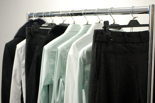
The label's shirts are constructed by a Swiss shirt manufacture which combines two dimensions of woven pin-tuck pleats, highlighting height and depth.

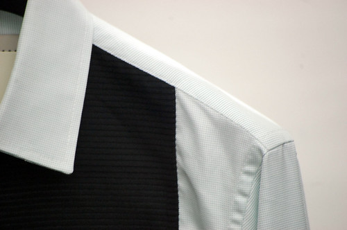
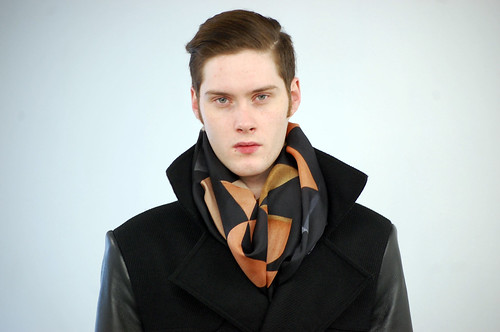
The silk print used on shirts and scarves are hand crafted and created through paper and watercolour placement, which have then been abstracted and distorted through size manipulation and experimentation.

A closer look at the print.

The label's commercial launch by Harrods has been a great chance to gage UK retail, and understand the balance of design and function. For AW11, the Baartmans & Siegel brand ethos continues to focus on Luxury, but due to popular demand, they have also begun to look at incorporating slightly more casual elements. Each season, the design duo have extended the collection, allowing for more versatility and for AW11, they have pushed it even further while still continuing to develop a specifically identifiable handwriting. Each season the pair enjoy building on classic lines and developing more evolved shapes, silhouettes and garments.

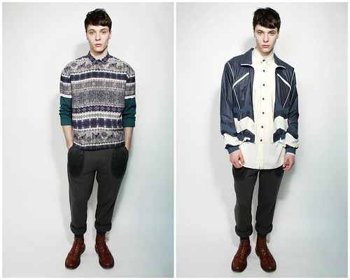
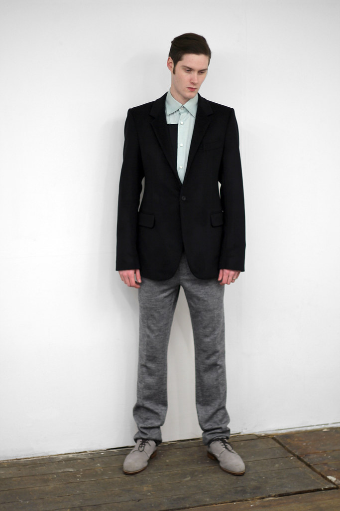
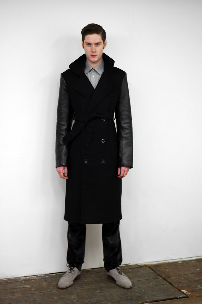
As useful as my detail shots are in highlighting texture play, I'm pleased to be able to share the recently shot collection look book with you...


Excitingly as of AW11, Baartmans & Siegel will be extending their retail points in the UK. Furthermore, they would like to continue to grow and be stocked within Europe, as well as internationally.  As well as being stocked in shops and boutiques, this season they plan on launching the e-commerce section of their website, where you will be able to by items such as shoes, knitwear and outerwear directly from the website. This will be a great way to purchase limited editions and key pieces of each collection. In near future, the label will be working on some exiting collaborations, and hope to present again at Menswear Day at LFW, to continue to build a strong presence within the menswear and design community. It is easy to predict that 2011 is going to be a huge year for the label.